Reading United Name, Logo & Colors

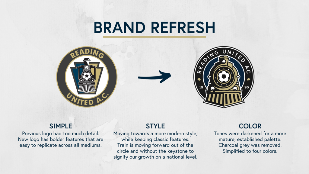
On January 30th, 2020, Reading United unveiled new logos and colors as part of a rebranding effort ahead of its 25th season.
The new logos act as a "refresh" of the previous brand, bringing forth a new era of Reading United soccer. Much of the previous branding effort from 2010 has stayed in place, but the logos and colors have been updated to modernize the marketing of the team.
Wandel Design (wandeldesign.com) completed the rebranding efforts.

Previous logoS
Berks Professional Sports, in collaboration with Launch Dynamic Media (www.launchdm.com), revised the name and logo for the club in 2010. The Reading United logo and colors incorporate several features tying into local and state history. The team’s primary colors are charcoal (black), gold, and navy blue. Black and gold are used to represent the City of Reading, PA (from the City of Reading seal) and the colors of Germania, one of the first soccer clubs in the Greater Reading area. Navy and gold are representative of the colors of the Commonwealth of Pennsylvania.
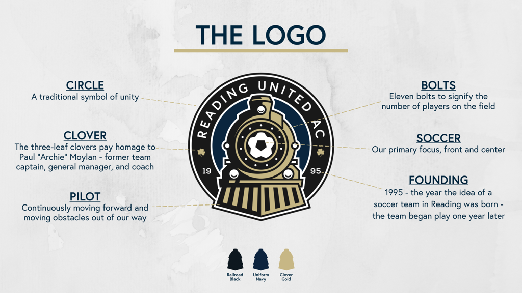
The team’s logo includes the train icon which pays homage to the fabled Reading Railroad. The Reading Railroad was one of the first railroads in the nation, with Reading the hub of rail traffic delivering coal to Philadelphia and the region. By 1871 the Reading Company was the largest corporation in the world. The train includes several notable features to the soccer community and the country. At the forefront of the train is a soccer ball, an obvious indicator of the team’s purpose and focus. Less obvious are the 13 stars (surrounding the soccer ball) representing the original 13 colonies. The shamrocks featured on the train honor the former Reading Rage team captain, general manager, and coach, Archie Moylan, a native of Ireland. The train is overlaid on a keystone, signifying Pennsylvania’s moniker as the Keystone State. Reading was also considered a “keystone city” with its thriving rail, steel, and textile industries providing jobs and goods to the country. The Reading United A.C. soccer team looks to continue Reading’s status as a conduit to Philadelphia in the form of player development and transition to the Philadelphia Union MLS team.
The team name was selected for two reasons. “United” is a suitable name representing the unity that the team looks to provide for the Reading area soccer community, through its club-neutral camps, clinics, and other soccer programs. Secondly, United is a “traditional” soccer team name, appealing to soccer purists in the area. Additionally, the United name ties in with the Philadelphia Union MLS team and its focus and direction. Finally, the A.C. (for Athletic Club) is used to indicate the club’s goals of being more than just a soccer team, but also a partner (like Body Zone, a complete sports and wellness complex) to future athletic programs, using soccer as the basis for learning and growth.

Latest League Two News

USL League Two Power Rankings: May 15
- By USLLeagueTwo.com Staff 05/15/2024, 3:00pm EDT

Monterey Bay F.C. 2 Grabs Advantage, Redlands FC Dazzles in Week 1 Storylines
- By USLLeagueTwo.com Staff 05/13/2024, 2:00pm EDT

St. Charles FC supporter group brings fan culture to pre-professional leagues
- By USLWLeague.com Staff 05/10/2024, 2:45pm EDT

Sportsengine Play to Stream USL League Two and W League Matches in 2024
- By USL Communications 05/10/2024, 11:00am EDT

A collection of the most memorable 'cupsets' in the U.S. Open Cup
- By ETHAN TRIEBSCH - ethan.triebsch@uslsoccer.com 05/07/2024, 11:30am EDT
